SMITH & LENTZ BREWING COMPANY
BRANDING / IDENTITY • PACKAGING
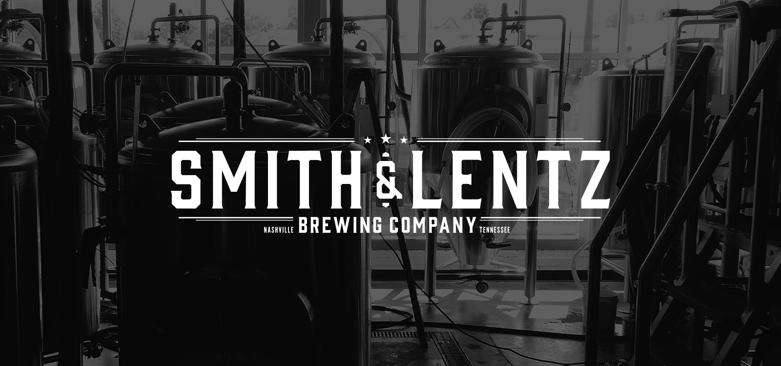
When I first met up with Adler and Kurt, they had just begin looking at buildings in Nashville to start their brewery. Both men had grown up in Wisconsin but had met and became friends in Austin where they hatched the plan to open Smith & Lentz Brewing Company. Having grown up watching their parents drink beer with distinct and bold branding, they wanted a logo that felt timeless while also reflecting the hard work and time that they put into their recipes. As we finished the branding process Smith & Lentz was just getting off the ground, over the past several years as the brewery has grown and evolved; we’ve updated the logo to be a more streamlined and bold mark.


As Smith & Lentz grew they began canning short runs of some of their most popular beer. What they needed was a labelling system that allowed them to switch out select elements in the design to cue drinkers into the different beers while creating a strong brand impression. To stand out against the noise of beer shelves, I designed them a brewery forward label using silver-foil backing printed with heavy matte black ink. The back edge of the labels included a section that can be personalized to match each beers unique vibe using different colors, type, patterns, foils treatments; all work with the text lockup.

As the brewery has grown and taken on its own personality, the identity I created for them has made its way onto a variety of items; here’s a few of my favorites.

Projects

Smith & Lentz Brewing CompanyProject type

Small Batch PresentsProject type

Julep JournalProject type

Emma - WebsiteProject type

Emma - Product BrandsProject type

Emma - EmailsProject type

TechnicoProject type

Gear SevenProject type

KopeckyProject type

Emma - AdsProject type

All Purpose ShineProject type

Album ArtProject type